Disadvantages of placing the design panel on the ListBox – cannot be reused:
With the old method, a design panel must be placed on each ListBox, such as a page in the example OrangeUISampleOfTutorial ListViewFrame_TestComplexLayout.pas:
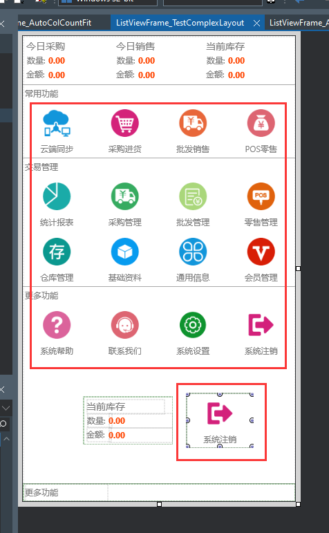
The design panel in the red rectangle is a commonly used style and is used as a menu item,
If I want to use this style on another page, I have to copy this design panel in the old way,
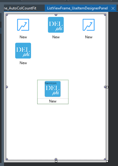
It is very complicated to use, and when there are multiple design panels on the interface, the design interface will appear very cluttered. For example this page:
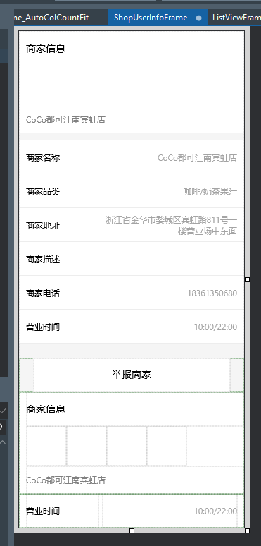
Therefore, in order to solve this problem, ListBox has added a property that specifies the style of the list item,
For example:
DefaultItemStyle:String,Used to specify the style for list items whose ItemType is sitDefault,
HeaderItemStyle:String,Used to specify the style of the list item when the ItemType is ditHeader
The use steps are as follows:
- First you need to install the OrangeUIStyles package in the control package。
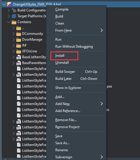
- A list item style is actually a Frame containing a design panel. This package is filled with well-designed and commonly used list item styles Frame, they are all in the OrangeUIStyles directory,
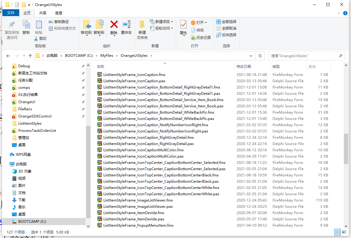
- Now I show how to specify default list item style for ListBox:
- First find the list item style Frame you need in the OrangeUIStyles package
- The meaning of the root file name, such as ListItemStyleFrame_IconTopCenter_CaptionBottomCenterBlack.pas, indicates that this style has the icon at the top, the title at the bottom, and the font is black.
- Let’s double-click to open it to see:
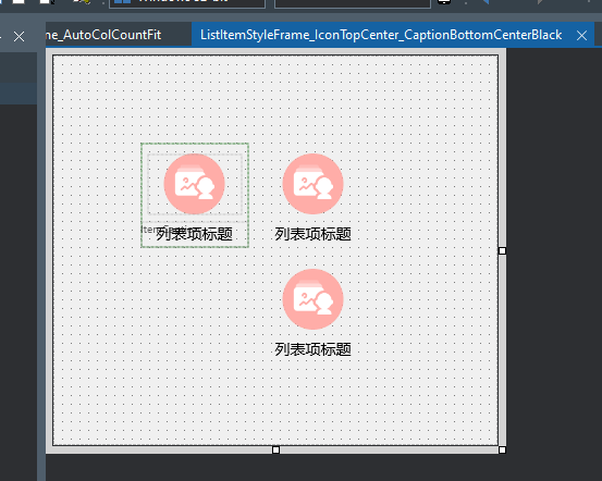
- There is only one design panel in this Frame, the one on the right is the display effect in the default state, and the one on the lower right is the display effect in the selected state。
- Let’s take a look at the initialization part of the Frame code, which is a style registration code:
- RegisterListItemStyle(‘IconTopCenter_CaptionBottomCenterBlack’,TFrameListItemStyle_IconTopCenter_CaptionBottomCenterBlack);
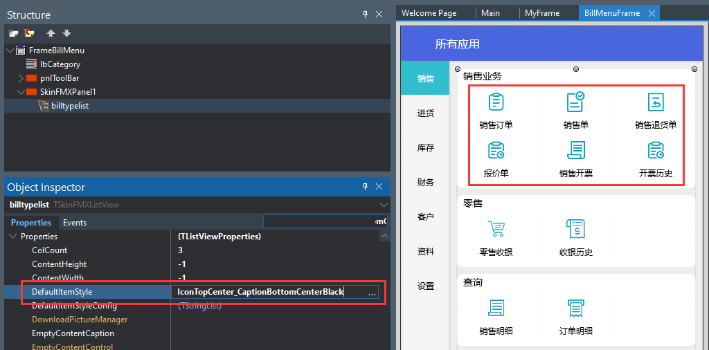
- Indicates that the name of this style is:IconTopCenter_CaptionBottomCenterBlack
- Next, we apply this style to the ListBox, and after setting the DefaultItemStyle of the ListView to IconTopCenter_CaptionBottomCenterBlack, the top of the list is displayed in this style。
- The unit that needs to reference this style in this page
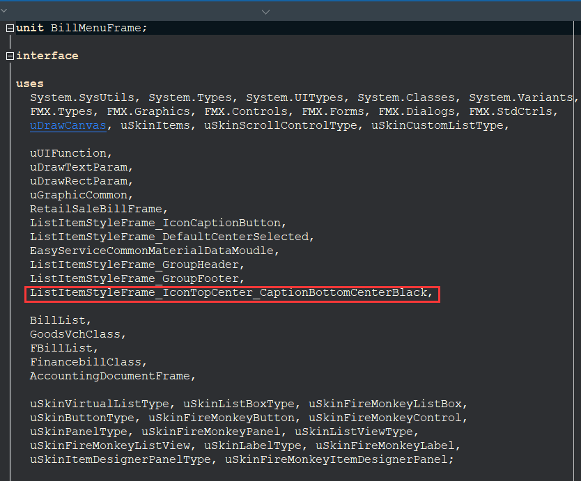
- If we want to use this style on another page, it’s very simple, just use the same settings
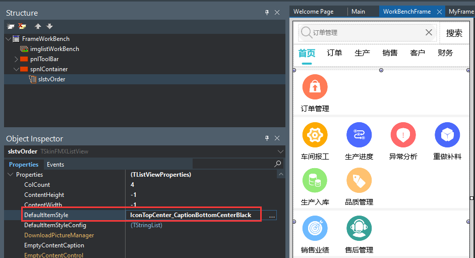
- Use the special handling of the list item style – the click event of the child control:
- ListBox added OnClickItemDesignerPanelChild event,
- OnClickItemDesignerPanelChild(Sender: TObject;AItem: TBaseSkinItem; AItemDesignerPanel: TSkinFMXItemDesignerPanel;AChild: TFmxObject);
- It will pass in the currently clicked list item AItem and the clicked child control AChild. We can use AChild.Name to determine which control is clicked, and then do the corresponding operations。
- Customization of list item style Frame
- For example there is a page where I want the title font in the list item style to be bigger。
- There are three ways:
- There is an OnNewListItemStyleFrameCacheInit event in ListBox for initial list style Frame
- ListBox has an OnPrepareDrawItem event that is called when the list item is drawn
- ListBox also has a DefaultItemStyleConfig property, which is used to configure the style of list items, for example, we enter code in it:
- lblItemCaption.Material.DrawCaptionParam.FontSize:=16;
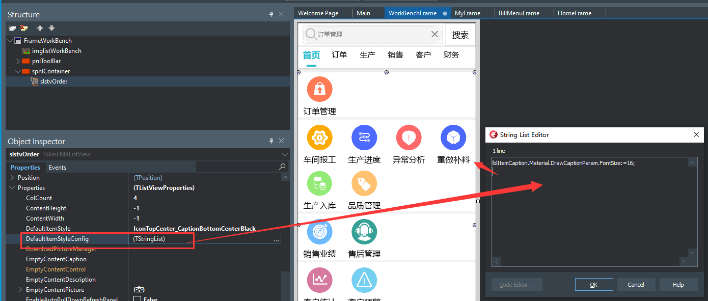
- The title font displayed in the list item becomes larger。
- How to add a list item style Frame:
- Create a new Frame in the OrangeUIStyles package and add settings panel controls to the Frame,
Frame needs to implement the IFrameBaseListItemStyle interface and return the design panel in GetItemDesignerPanel。

-
- Then add the following code to the initialization section and finalization of the Frame unit:
initialization
RegisterListItemStyle(style name,FrameClass);
finalization
UnRegisterListItemStyle(style name);

-
- Reinstall the OrangeUIStyles package。